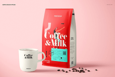
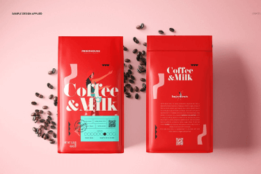
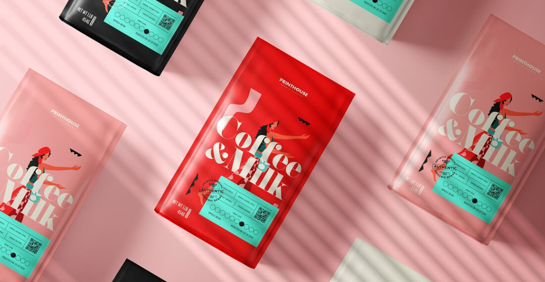
Coffee, the golden nectar of the gods and the most popular drink in the world, comes in many different shapes and forms. Coffe & Milk coffee hearkens back to period roots, suffusing the consumer with an experience of authenticity and unity by covenant: one man with every other man partaking and sharing equally in the greater good. The patterns are inspired by unifying themes, with all brand touchpoints connoting unity and harmony.
Our main objective was to re-think traditional packaging methodology. Used as a tool to showcase our ability to think & work beyond convention, we determined from the out-set that drawing inspiration from uncommon sources was essential to the success of the project. Cue the Terpentine: An attractive shape, an airtight seal, something unexpected. This container delivered on all counts, but how to break from the unfriendly, industrial, and for all intensive purposes toxic associations we as consumers have made with that form?
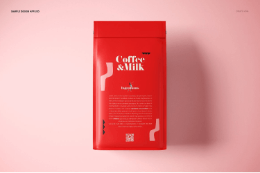
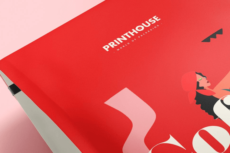
A bright yet soft colour pallette combined with elegant and approachable serif type helps soften the brand against the harshness of material. A quick sanding, prime, and dip in paint helps add some individuality among the products and re-enforces the handmade nature of the product, No two wishbones being exactly the same.
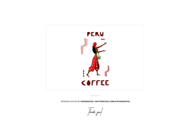
A bright yet soft colour pallette combined with elegant and approachable serif type helps soften the brand against the harshness of material. A quick sanding, prime, and dip in paint helps add some individuality among the products and re-enforces the handmade nature of the product, No two wishbones being exactly the same.

发表回复